在 Python 中,可以用 matplotlib 画图。在使用前可以使用 (sudo) pip install matplotlib 安装。
限于篇幅,我们无法详尽地介绍 Matplot 的用法,仅通过一些实例让诸位感受一下 Matplot 画图的几个思想和语法。
在使用 Matplotlib 时,如果不知道某个图该怎么画,查看文档可能是最简单的方法,其官网: https://matplotlib.org 上提供了非常详细的示例、文档。此外, https://github.com/rougier/matplotlib-tutorial 也提供了一个非常好的教程,可以参阅。
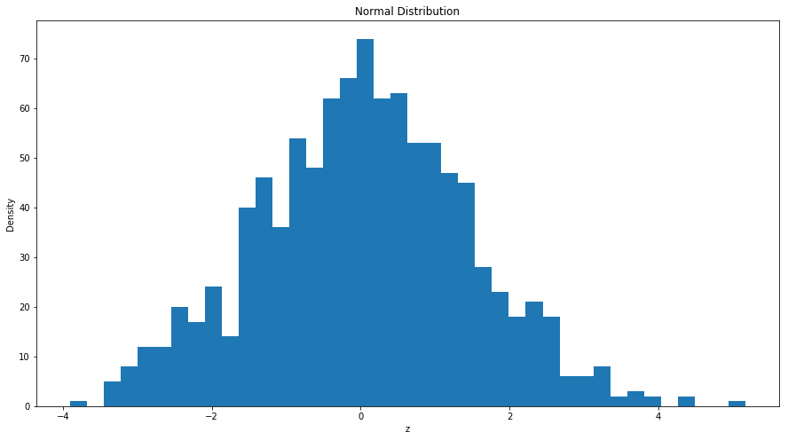
实例1:数据的直方图以及散点图
在接下来的例子中看我们随机生成了一组期望为 0,方差为 2,包含 500 个观察值的随机数,并画出其直方图:
= nprd.normal(0 ,np.sqrt(2 ),1000 ) ## 生成100个均值为0,方差为2的正态分布 ## 导入matplotlib import matplotlib.pyplot as plt ## 使图形直接插入到jupyter中 % matplotlib inline# 设定图像大小 'figure.figsize' ] = (15.0 , 8.0 )= 40 ) ##柱状图,40 个柱子 'z' )"Density" )'Normal Distribution' )## 画图
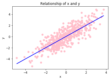
而以下代码,产生了 500 个 \(x \sim N\left(0,2\right)\) ,以及 \(y=x+u\) ,\(u\sim N\left(0,1\right)\) ,并将其散点图、和关系图花在了同一张图上:
= nprd.normal(0 ,np.sqrt(2 ),500 ) ## 生成100个均值为0,方差为2的正态分布 = x+ nprd.normal(0 ,1 ,500 ) ## y与x为线性关系 = 'pink' ) ##散点图 = 'blue' ) ## 回归曲线 'x' )"y" )'Relationship of x and y' )## 画图
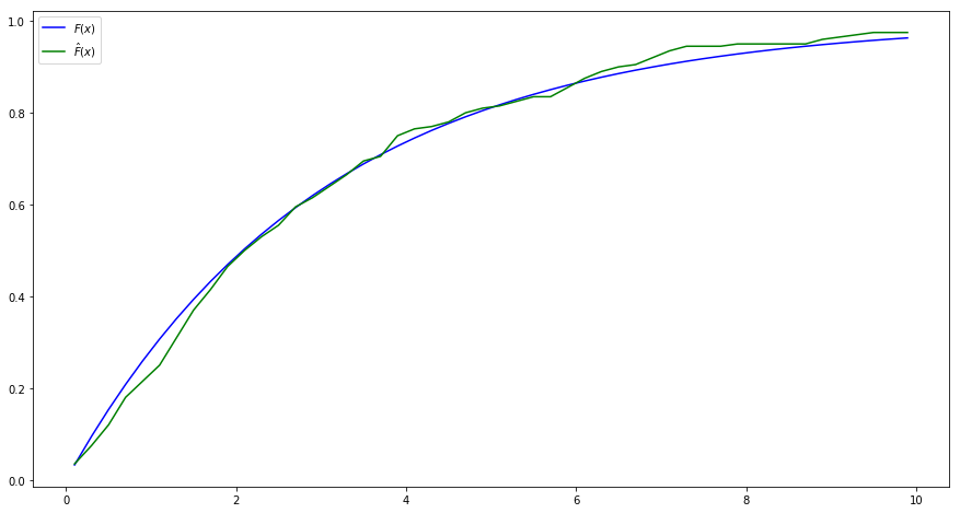
实例2:经验分布函数
在下面的例子中,我们使用分布函数逆函数的方法,产生了一系列的服从指数分布的随机数,进而计算其经验分布函数:\[\hat{F}\left(x\right)=\frac{1}{N}\sum_{i=1}^{N}{1\left\{x_i\leq x\right\}}\]
由于指数分布的分布函数为:\[F\left(x\right)=1-exp\left\{ -\frac{1}{b}x \right\}\]
从而根据你分布函数法,给定一个b,通过均匀分布u产生指数分布的随机数的公式为:\[x=-b\cdot \log\left(u\right)\]
接下来,我们使用matplotlib将李璐的分布函数和计算的经验分布函数画在了图上。
import numpy as npimport numpy.random as nprd## 设定参数 = 3 #指数分布参数 = 200 #样本容量 ## 生成N个x~F(x)=1-exp{-(1/b)*x} =- b* np.log(nprd.random(N))## 给定一些点,在这些点上计算分布函数和经验分布函数 = np.linspace(0.1 ,9.9 ,50 ) #0.1,0.3,...,9.9 ## 计算理论的分布函数 = 1 - np.exp((- 1 / b)* x)## 计算经验分布函数 = lambda s: np.sum (X<= s)/ N # lambda表达式,定义了s点处的经验分布函数 = np.array(list (map (empirical_F,x))) # 计算x的所有点的经验分布函数 ## 计算经验分布函数与真实的分布函数之间的绝对差异 = np.abs (F- F_hat)## 打印两个分布函数及其绝对差异,以及平均的绝对差异 print (" x | 分布函数| 经验分布函数| 差的绝对值" )for i in range (50 ):print (" %.1f | %.5f | %.5f | %.5f " % (x[i],F[i],F_hat[i],bias[i]))print ("Mean absolute bias:" ,np.sum (bias)/ 50 )## 导入matplotlib import matplotlib.pyplot as plt ## 使图形直接插入到jupyter中 % matplotlib inline# 设定图像大小 'figure.figsize' ] = (15.0 , 8.0 )= r'$F(x)$' ,color= 'blue' ) ## 画出理论的分布函数 = r'$\hat {F} (x)$' ,color= 'green' ) ## 画出经验分布函数 = 'upper left' , frameon= True )## 画图
 x  | 分布函数| 经验分布函数| 差的绝对值
0.1 |0.03278 | 0.03500  | 0.00222
0.3 |0.09516 | 0.07500  | 0.02016
0.5 |0.15352 | 0.12000  | 0.03352
0.7 |0.20811 | 0.18000  | 0.02811
0.9 |0.25918 | 0.21500  | 0.04418
1.1 |0.30696 | 0.25000  | 0.05696
1.3 |0.35166 | 0.31000  | 0.04166
1.5 |0.39347 | 0.37000  | 0.02347
1.7 |0.43259 | 0.41500  | 0.01759
1.9 |0.46918 | 0.46500  | 0.00418
2.1 |0.50341 | 0.50000  | 0.00341
2.3 |0.53544 | 0.53000  | 0.00544
2.5 |0.56540 | 0.55500  | 0.01040
2.7 |0.59343 | 0.59500  | 0.00157
2.9 |0.61965 | 0.61500  | 0.00465
3.1 |0.64418 | 0.64000  | 0.00418
3.3 |0.66713 | 0.66500  | 0.00213
3.5 |0.68860 | 0.69500  | 0.00640
3.7 |0.70868 | 0.70500  | 0.00368
3.9 |0.72747 | 0.75000  | 0.02253
4.1 |0.74504 | 0.76500  | 0.01996
4.3 |0.76149 | 0.77000  | 0.00851
4.5 |0.77687 | 0.78000  | 0.00313
4.7 |0.79126 | 0.80000  | 0.00874
4.9 |0.80472 | 0.81000  | 0.00528
5.1 |0.81732 | 0.81500  | 0.00232
5.3 |0.82910 | 0.82500  | 0.00410
5.5 |0.84012 | 0.83500  | 0.00512
5.7 |0.85043 | 0.83500  | 0.01543
5.9 |0.86008 | 0.85500  | 0.00508
6.1 |0.86910 | 0.87500  | 0.00590
6.3 |0.87754 | 0.89000  | 0.01246
6.5 |0.88544 | 0.90000  | 0.01456
6.7 |0.89283 | 0.90500  | 0.01217
6.9 |0.89974 | 0.92000  | 0.02026
7.1 |0.90621 | 0.93500  | 0.02879
7.3 |0.91226 | 0.94500  | 0.03274
7.5 |0.91792 | 0.94500  | 0.02708
7.7 |0.92321 | 0.94500  | 0.02179
7.9 |0.92816 | 0.95000  | 0.02184
8.1 |0.93279 | 0.95000  | 0.01721
8.3 |0.93713 | 0.95000  | 0.01287
8.5 |0.94118 | 0.95000  | 0.00882
8.7 |0.94498 | 0.95000  | 0.00502
8.9 |0.94853 | 0.96000  | 0.01147
9.1 |0.95185 | 0.96500  | 0.01315
9.3 |0.95495 | 0.97000  | 0.01505
9.5 |0.95786 | 0.97500  | 0.01714
9.7 |0.96057 | 0.97500  | 0.01443
9.9 |0.96312 | 0.97500  | 0.01188
Mean absolute bias: 0.0147749175566
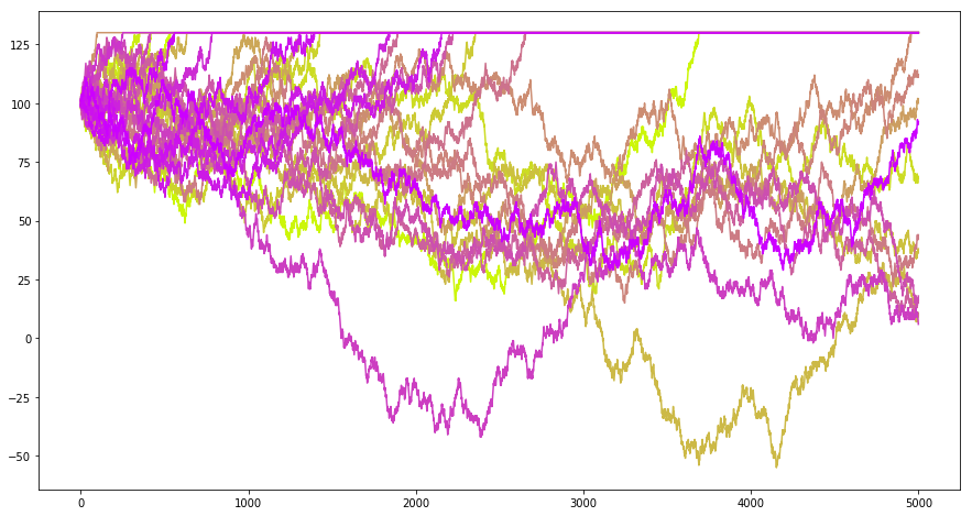
实例3:停止的鞅
现在考虑这么一个问题:如果我有 100 块钱,现在可以进行赌博,每次以 0.5 的概率赚一块钱,以 0.5 的概率赔一块钱,赚到 130 块我就收手,那么我的财富应该会如何变化?以下的程序模拟了这个问题:
import numpy as npimport numpy.random as nprd= 5000 = 100 def gen_martingale():= []= x0for t in range (T):if x>= 130 := xelse := x+ (1 if nprd.uniform()> 0.5 else - 1 )return Ximport matplotlib.pyplot as plt% matplotlib inline# 设定图像大小 'figure.figsize' ] = (15.0 , 8.0 )= 30 = [t for t in range (T)]= np.linspace(0 ,1 ,N)for i in range (N):= gen_martingale()= (0.8 ,1 - corlors[i],corlors[i]))## 画图
实例4:大数定律和中心极限定理
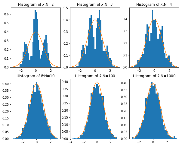
我们知道,根据大数定律,样本均值会收敛到总体均值,即 \(\bar{x}\rightarrow_p\mu\) ,以下代码通过产生 10000 个服从 0-1 分布的随机数(真实概率为0.5,比如抛硬币),计算了前 n 次的均值,并将其画在图上:
import numpy as npfrom numpy import random as nprd= 0.5 def sampling(N):## 产生Bernouli样本 = nprd.rand(N)< True_Preturn x= 10000 #模拟次数 = np.zeros(M)= np.array([i+ 1 for i in range (M)])= sampling(M)for i in range (M):if i== 0 := x[i]else := (x[i]+ xbar[i- 1 ]* i)/ (i+ 1 )## 导入matplotlib import matplotlib.pyplot as plt ## 使图形直接插入到jupyter中 % matplotlib inline# 设定图像大小 'figure.figsize' ] = (10.0 , 8.0 )= r'$\bar {x} $' ,color= 'pink' ) ## xbar = np.ones(M)* True_P= r'$0.5$' ,color= 'black' ) ## true xbar 'N' )r'$\bar {x} $' )= 'upper right' , frameon= True )## 画图
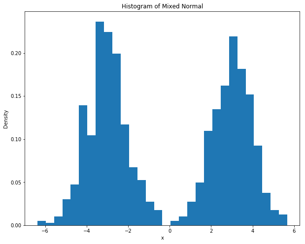
而根据中心极限定理,当样本量足够大时,样本均值服从正态分布:\(\bar{x}\sim N\left(\mu,\sigma^2/N\right)\) 。以下代码,根据不同的样本量(\(N\) ),分别产生一些混合正态分布(双峰的),并计算其均值,计算 2000 次样本均值,并观察给定样本量的条件下 2000 次样本均值的分布情况。最终将样本均值的分布情况绘制成图:
import numpy as npfrom numpy import random as nprddef sampling(N):## 产生一组样本,以0.5的概率为z+3,0.5的概率为z-3,其中z~N(0,1) = nprd.rand(N)< 0.5 = nprd.randn(N)= np.array([z[i]+ 3 if d[i] else z[i]- 3 for i in range (N)])return x= [2 ,3 ,4 ,10 ,100 ,1000 ] # sample size = 2000 = []for n in N:= np.zeros(M)for i in range (M):= sampling(n)= np.mean(x)/ np.sqrt(10 / n) ## 标准化,因为var(x)=10 ## 导入matplotlib import matplotlib.pyplot as pltimport matplotlib.mlab as mlab## 使图形直接插入到jupyter中 % matplotlib inline# 设定图像大小 'figure.figsize' ] = (10.0 , 8.0 )= sampling(1000 )'x' )'Density' )'Histogram of Mixed Normal' )= 30 ,normed= 1 ) ## histgram ## 画图 ## 样本均值 = plt.subplot(2 ,3 ,1 )= plt.subplot(2 ,3 ,2 )= plt.subplot(2 ,3 ,3 )= plt.subplot(2 ,3 ,4 )= plt.subplot(2 ,3 ,5 )= plt.subplot(2 ,3 ,6 )## normal density = np.linspace(- 3 ,3 ,100 )= [1.0 / np.sqrt(2 * np.pi)* np.exp(- i** 2 / 2 ) for i in x]def plot_density(ax,data,N):= 30 ,normed= 1 ) ## histgram r'Histogram of $\bar {x} $:N= %d ' % N)0 ],N[0 ])1 ],N[1 ])2 ],N[2 ])3 ],N[3 ])4 ],N[4 ])5 ],N[5 ])## 画图
实例5:Beta分布的矩估计
矩估计
如果 \(x_i \sim Beta(\alpha, \beta)\) ,由于 \(E(x_i)=\frac{\alpha}{\alpha + \beta}\) ,而 \(E(x_i^2)=\frac{\alpha ^2}{(\alpha + \beta)^2}+\frac{\alpha \beta}{(\alpha + \beta)^2 (\alpha+\beta+1)}\) ,从而我们的矩估计即联立:
\[\frac{\hat{\alpha}}{\hat{\alpha} + \hat{\beta}}=\bar{x}\]
\[\frac{\hat{\alpha} ^2}{(\hat{\alpha} + \hat{\beta})^2}+\frac{\hat{\alpha} \hat{\beta}}{(\hat{\alpha} + \hat{\beta})^2 (\hat{\alpha}+\hat{\beta}+1)}=\overline{x^{2}}
\]
即可得到矩估计。在这里,我们将联立方程问题转化为一个最优化问题,即最小化:
\[\min_{\hat{\alpha},\hat{\beta}}\left[\frac{\hat{\alpha}}{\hat{\alpha} + \hat{\beta}}-\bar{x} \right]^2+\left[\frac{\hat{\alpha} ^2}{(\hat{\alpha} + \hat{\beta})^2}+\frac{\hat{\alpha} \hat{\beta}}{(\hat{\alpha} + \hat{\beta})^2 (\hat{\alpha}+\hat{\beta}+1)}-\overline{x^{2}}\right]^2
\]
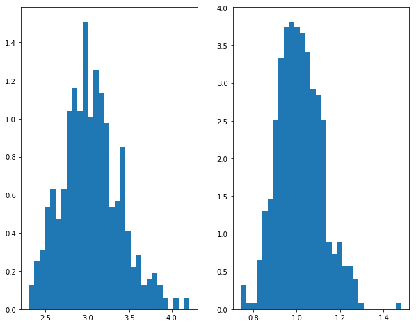
我们将会重复抽样、估计M=500次,并根据这500次的结果计算矩估计量的偏差(bias)、标准误(standard error)以及均方误差(mean sqrared error)。
import numpy as npfrom numpy import random as nprdfrom scipy.optimize import minimizeimport scipy as scdef sampling(a,b,N):= nprd.beta(a,b,N)return xdef estimate(x):= np.mean(x)= [xi** 2 for xi in x]= np.mean(x2)def obj(theta):return (theta[0 ]/ (theta[0 ]+ theta[1 ])- meanx)** 2 + ((theta[0 ]/ (theta[0 ]+ theta[1 ]))** 2 + (theta[0 ]* theta[1 ])/ ((theta[0 ]+ theta[1 ])** 2 * (theta[0 ]+ theta[1 ]+ 1 ))- meanx2)** 2 = minimize(obj, np.array([1 ,1 ]), method= 'nelder-mead' , options= {'xtol' : 1e-4 , 'disp' : False })return res= 500 ## simulation times = 200 ## sample size = 3 = 1 ## true value = np.zeros((M,2 ), np.float64)for m in range (M):= sampling(a,b,N)= estimate(x)= res.x= np.average(RESULT, 0 )= MEAN_RESULT- np.array([a,b])= np.std(RESULT, 0 )= np.array([i** 2 for i in STD])+ np.array([i** 2 for i in BIAS])= np.array([np.sqrt(i) for i in MSE2])print ("Bias = " , BIAS)print ("s.e. = " , STD)print ("RMSE = " , MSE)## 画图 import matplotlib.pyplot as plt## 使图形直接插入到jupyter中 % matplotlib inline# 设定图像大小 'figure.figsize' ] = (10.0 , 8.0 )## 样本均值 = plt.subplot(1 ,2 ,1 )= plt.subplot(1 ,2 ,2 )0 ],bins= 30 ,normed= 1 )1 ],bins= 30 ,normed= 1 )
Bias =  [ 0.04108888  0.01504609]
s.e. =  [ 0.34001766  0.10260341]
RMSE =  [ 0.34249132  0.10370075]
极大似然估计
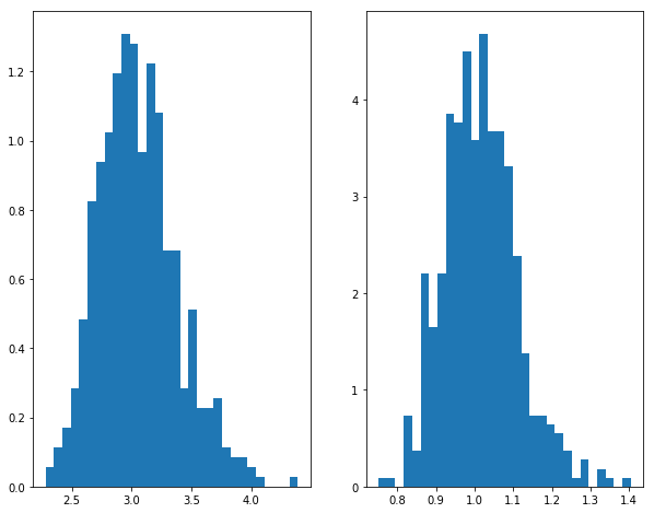
由于Beta分布的对数似然函数为\[\ln \left( \alpha, \beta | x \right)=\sum_{i=1}^N \left[ -\ln (Beta(\alpha,\beta))+(\alpha-1) \ln (x_i) + (\beta-1)\ln (1-x_i) \right]\] 最大化似然函数,或者最小化负的似然函数,即可得到极大似然估计。
import numpy as npfrom numpy import random as nprdfrom scipy.optimize import minimizeimport scipy as scdef sampling(a,b,N):= nprd.beta(a,b,N)return xdef estimate(x):def log_likelihood(theta):= np.array([- 1 * np.log(sc.special.beta(theta[0 ],theta[1 ]))+ (theta[0 ]- 1 )* np.log(xi)+ (theta[1 ]- 1 )* np.log(1 - xi) for xi in x])return - 1 * np.mean(likeli)= minimize(log_likelihood, np.array([1 ,1 ]), method= 'nelder-mead' , options= {'xtol' : 1e-4 , 'disp' : False })return res= 500 ## simulation times = 200 ## sample size = 3 = 1 ## true value = np.zeros((M,2 ), np.float64)for m in range (M):= sampling(a,b,N)= estimate(x)= res.x= np.average(RESULT, 0 )= MEAN_RESULT- np.array([a,b])= np.std(RESULT, 0 )= np.array([i** 2 for i in STD])+ np.array([i** 2 for i in BIAS])= np.array([np.sqrt(i) for i in MSE2])print ("Bias = " , BIAS)print ("s.e. = " , STD)print ("RMSE = " , MSE)## 画图 import matplotlib.pyplot as plt## 使图形直接插入到jupyter中 % matplotlib inline# 设定图像大小 'figure.figsize' ] = (10.0 , 8.0 )## 样本均值 = plt.subplot(1 ,2 ,1 )= plt.subplot(1 ,2 ,2 )0 ],bins= 30 ,normed= 1 )1 ],bins= 30 ,normed= 1 )
Bias =  [ 0.05519612  0.01536957]
s.e. =  [ 0.32866097  0.09479056]
RMSE =  [ 0.33326362  0.09602851]