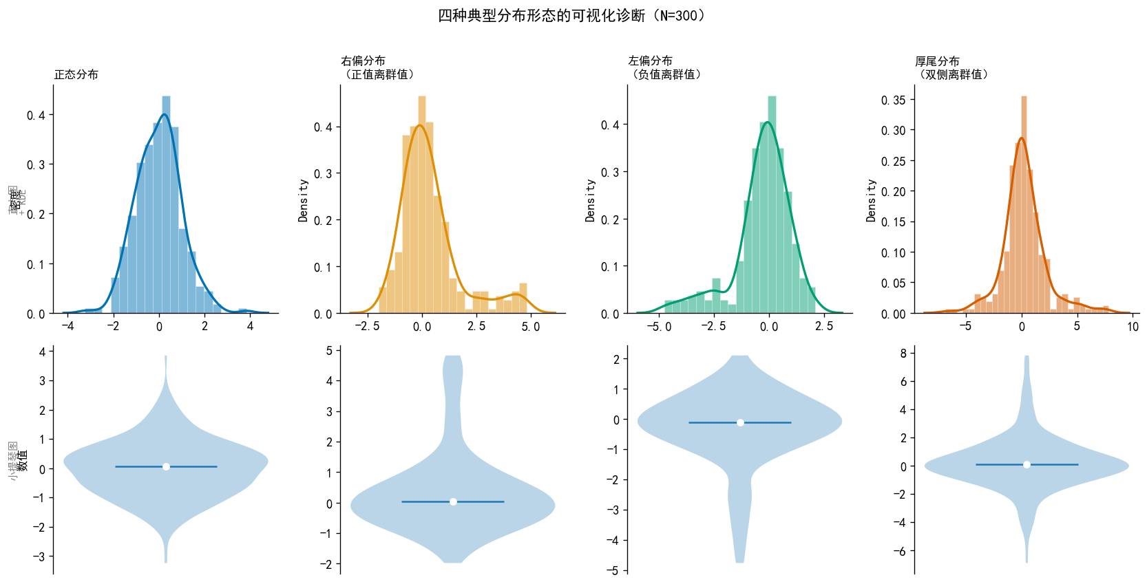
18  数据分布:原理与可视化 — 配套代码

18.1 全局设置(每次使用前必须首先运行此单元格)

import numpy as np
import pandas as pd
import matplotlib.pyplot as plt
import matplotlib as mpl
import seaborn as sns
from scipy import stats
import warnings
warnings.filterwarnings("ignore")
mpl.set_loglevel("error")  # 只显示错误,不显示警告

# ── 图片中支持中文字体 ──────────────────────────────────────────────
#plt.rcParams["font.family"] = ["SimHei", "WenQuanYi Micro Hei", "Heiti TC"]
plt.rcParams["font.family"] = "SimHei"  # 只留 Windows 自带黑体,无任何警告
plt.rcParams["axes.unicode_minus"] = False

# ── 全局样式 ──────────────────────────────────────────────
plt.rcParams['figure.dpi']        = 120
plt.rcParams['savefig.dpi']       = 300
plt.rcParams['font.size']         = 11
plt.rcParams['axes.spines.top']   = False
plt.rcParams['axes.spines.right'] = False

np.random.seed(42)
print('✅ 全局设置完成')
✅ 全局设置完成

18.2 均值相同,分布不同:可视化的必要性

三组数据均值和标准差完全相同,但分布形态截然不同。

np.random.seed(42)
N = 1000

# 三组数据:均值=0, 标准差≈1,但形态不同
data_A = np.random.normal(0, 1, N)                          # 正态分布
data_B = np.concatenate([                                    # 双峰分布
    np.random.normal(-1.5, 0.5, N//2),
    np.random.normal(1.5, 0.5, N//2)
])
data_C = np.random.exponential(1, N)                         # 右偏分布
data_C = (data_C - data_C.mean()) / data_C.std()            # 标准化

datasets = {'A:正态分布': data_A,
            'B:双峰分布\n(两个子群体混合)': data_B,
            'C:右偏分布\n(极端正值更多)': data_C}

# 打印统计量验证
print('── 三组数据的基本统计量 ──')
for name, d in datasets.items():
    label = name.split('\n')[0]
    print(f'{label:12s}  均值={d.mean():.3f}  标准差={d.std():.3f}  '
          f'偏度={stats.skew(d):.2f}  峰态={stats.kurtosis(d):.2f}')

# ── 绘图 ─────────────────────────────────────────────────
fig, axes = plt.subplots(1, 3, figsize=(12, 4))
colors = sns.color_palette('colorblind', 3)

for ax, (title, data), color in zip(axes, datasets.items(), colors):
    ax.hist(data, bins=40, density=True, alpha=0.5,
            color=color, edgecolor='none')
    sns.kdeplot(data, ax=ax, color=color, linewidth=2)
    ax.set_title(title, fontsize=11, fontweight='bold', loc='left')
    ax.set_xlabel('数值', fontsize=10)
    ax.set_ylabel('密度', fontsize=10)
    ax.set_xlim(-5, 5)
    sns.despine(ax=ax)

plt.suptitle('均值=0,标准差=1:三组数据的分布形态截然不同',
             fontsize=13, fontweight='bold', y=1.02)
plt.tight_layout()
plt.show()
── 三组数据的基本统计量 ──
A:正态分布        均值=0.019  标准差=0.979  偏度=0.12  峰态=0.07
B:双峰分布        均值=0.035  标准差=1.563  偏度=-0.01  峰态=-1.62
C:右偏分布        均值=0.000  标准差=1.000  偏度=1.88  峰态=4.74

18.3 频数、频率、密度三种直方图对比

同一组数据,三种纵轴的含义与适用场景。

np.random.seed(42)
N = 500
# 模拟日收益率(%)
returns = np.random.normal(0.1, 2.0, N)

fig, axes = plt.subplots(1, 3, figsize=(12, 4))
bins = 25
color = '#4393c3'

# ── 子图1:频数 ───────────────────────────────────────────
axes[0].hist(returns, bins=bins, color=color, edgecolor='white', linewidth=0.5)
axes[0].set_title('频数直方图\n纵轴 = 每个区间的数据点数', fontsize=10,
                  fontweight='bold', loc='left')
axes[0].set_ylabel('频数(个)', fontsize=10)
axes[0].set_xlabel('日收益率(%)', fontsize=10)
sns.despine(ax=axes[0])

# ── 子图2:频率 ───────────────────────────────────────────
counts, edges = np.histogram(returns, bins=bins)
freq = counts / counts.sum()
width = edges[1] - edges[0]
axes[1].bar(edges[:-1], freq, width=width, color=color,
            edgecolor='white', linewidth=0.5, align='edge')
axes[1].set_title('频率直方图\n纵轴 = 频率(面积之和=1)', fontsize=10,
                  fontweight='bold', loc='left')
axes[1].set_ylabel('频率', fontsize=10)
axes[1].set_xlabel('日收益率(%)', fontsize=10)
axes[1].text(0.97, 0.95, f'面积之和 = {freq.sum():.3f}',
             transform=axes[1].transAxes, ha='right', va='top',
             fontsize=9, color='gray')
sns.despine(ax=axes[1])

# ── 子图3:密度 + KDE + 理论正态曲线 ─────────────────────
axes[2].hist(returns, bins=bins, density=True, color=color,
             edgecolor='white', linewidth=0.5, alpha=0.6, label='密度直方图')
sns.kdeplot(returns, ax=axes[2], color='#2166ac',
            linewidth=2, label='KDE 估计')
# 叠加理论正态曲线
x_range = np.linspace(returns.min(), returns.max(), 200)
axes[2].plot(x_range,
             stats.norm.pdf(x_range, returns.mean(), returns.std()),
             'r--', linewidth=1.5, label='正态拟合')
axes[2].set_title('密度直方图\n可与 KDE、PDF 直接叠加比较', fontsize=10,
                  fontweight='bold', loc='left')
axes[2].set_ylabel('密度', fontsize=10)
axes[2].set_xlabel('日收益率(%)', fontsize=10)
axes[2].legend(fontsize=9)
sns.despine(ax=axes[2])

plt.suptitle('同一组数据,三种纵轴的直方图(N=500,模拟日收益率)',
             fontsize=12, fontweight='bold', y=1.02)
plt.tight_layout()
plt.show()

print('💡 关键:只有密度直方图(density=True)才能与 KDE 曲线叠加在同一坐标系比较。')

💡 关键:只有密度直方图(density=True)才能与 KDE 曲线叠加在同一坐标系比较。

18.4 Bin 宽度选择的影响

np.random.seed(42)
N = 300
data = np.random.normal(0, 1, N)

fig, axes = plt.subplots(1, 3, figsize=(12, 4))
K_values = [4, 20, 60]
labels   = ['K=4(过少)\n过度平滑,丢失细节',
             'K=20(适中)\n清晰呈现分布形态',
             'K=60(过多)\n噪声过多,难以判断趋势']

# 真实正态密度曲线
x_range = np.linspace(-4, 4, 300)
pdf_true = stats.norm.pdf(x_range)

for ax, K, label in zip(axes, K_values, labels):
    ax.hist(data, bins=K, density=True, color='#4393c3',
            edgecolor='white', linewidth=0.4, alpha=0.7)
    ax.plot(x_range, pdf_true, 'r--', linewidth=1.8,
            label='真实 N(0,1)')
    ax.set_xlim(-4, 4)
    ax.set_ylim(0, 0.65)
    ax.set_title(label, fontsize=10, fontweight='bold', loc='left')
    ax.set_xlabel('数值', fontsize=10)
    ax.set_ylabel('密度', fontsize=10)
    sns.despine(ax=ax)

axes[0].legend(fontsize=9)
plt.suptitle('Bin 数量对直方图形态的影响(N=300,真实分布为红色虚线)',
             fontsize=12, fontweight='bold', y=1.02)
plt.tight_layout()
plt.show()

18.5 三种 Bin 自动选择规则对比

np.random.seed(42)
N = 500
# 厚尾数据(模拟金融收益率)
data = stats.t.rvs(df=4, size=N) * 2

rules   = ['sturges', 'scott', 'fd']
titles  = ['Sturges 规则\n(假设正态,适合小样本)',
           'Scott 规则\n(最优均方误差,假设正态)',
           'FD 规则\n(基于 IQR,对厚尾更稳健)']

fig, axes = plt.subplots(1, 3, figsize=(12, 4))

for ax, rule, title in zip(axes, rules, titles):
    counts, edges, _ = ax.hist(data, bins=rule, density=True,
                               color='#4393c3', edgecolor='white',
                               linewidth=0.4, alpha=0.7)
    sns.kdeplot(data, ax=ax, color='#d7191c', linewidth=1.8)
    n_bins = len(edges) - 1
    ax.set_title(f'{title}\nK = {n_bins} 个 bins',
                 fontsize=10, fontweight='bold', loc='left')
    ax.set_xlabel('数值', fontsize=10)
    ax.set_ylabel('密度', fontsize=10)
    sns.despine(ax=ax)

plt.suptitle('三种 Bin 自动选择规则对比(厚尾数据,N=500)\n'
             'FD 规则通常在金融数据中效果更好',
             fontsize=12, fontweight='bold', y=1.04)
plt.tight_layout()
plt.show()

# 打印各规则的 bin 数
for rule in rules:
    _, edges = np.histogram(data, bins=rule)
    print(f'{rule:10s}: K = {len(edges)-1:3d} bins, h = {edges[1]-edges[0]:.3f}')

sturges   : K =  10 bins, h = 2.343
scott     : K =  21 bins, h = 1.116
fd        : K =  33 bins, h = 0.710

18.6 KDE:带宽选择的影响

np.random.seed(42)
N = 200
data = np.random.normal(0, 1, N)
x_range = np.linspace(-5, 5, 500)
pdf_true = stats.norm.pdf(x_range)

bandwidths = [0.1, 0.5, 2.0]
bw_labels  = ['h=0.1(欠平滑)\n追着每个数据点走',
              'h=0.5(适中)\n接近真实分布',
              'h=2.0(过平滑)\n细节被掩盖']

fig, axes = plt.subplots(1, 3, figsize=(12, 4))

for ax, h, label in zip(axes, bandwidths, bw_labels):
    # 密度直方图(背景)
    ax.hist(data, bins='fd', density=True, color='#b2d8f0',
            edgecolor='white', linewidth=0.3, alpha=0.6)
    # KDE 曲线(指定带宽)
    kde = stats.gaussian_kde(data, bw_method=h / data.std())
    ax.plot(x_range, kde(x_range), color='#2166ac', linewidth=2.2,
            label='KDE')
    # 真实密度曲线(参考)
    ax.plot(x_range, pdf_true, 'r--', linewidth=1.5, alpha=0.8,
            label='真实 N(0,1)')
    ax.set_xlim(-5, 5)
    ax.set_ylim(0, 0.9)
    ax.set_title(label, fontsize=10, fontweight='bold', loc='left')
    ax.set_xlabel('数值', fontsize=10)
    ax.set_ylabel('密度', fontsize=10)
    sns.despine(ax=ax)

axes[0].legend(fontsize=9)
plt.suptitle('KDE 带宽选择的影响(N=200,真实分布为红色虚线)',
             fontsize=12, fontweight='bold', y=1.02)
plt.tight_layout()
plt.show()

18.7 KDE vs 直方图:密度叠加图

展示直方图与 KDE 的互补关系——直方图”离散”,KDE”平滑”。

np.random.seed(42)
N = 300
# 混合分布(双峰)
data = np.concatenate([
    np.random.normal(-2, 0.8, N//2),
    np.random.normal(2, 0.8, N//2)
])

fig, axes = plt.subplots(1, 2, figsize=(11, 4))

# ── 左图:只有直方图 ──────────────────────────────────────
for K, alpha, label in [(5, 0.8, 'K=5(过少)'), (30, 0.5, 'K=30(过多)')]:
    axes[0].hist(data, bins=K, density=True, alpha=alpha, label=label,
                 edgecolor='white', linewidth=0.3)
axes[0].set_title('直方图:结果依赖 bin 的选择',
                  fontsize=11, fontweight='bold', loc='left')
axes[0].set_xlabel('数值', fontsize=10)
axes[0].set_ylabel('密度', fontsize=10)
axes[0].legend(fontsize=9)
sns.despine(ax=axes[0])

# ── 右图:直方图 + KDE,展示双峰 ─────────────────────────
axes[1].hist(data, bins='fd', density=True, color='#b2d8f0',
             edgecolor='white', linewidth=0.3, alpha=0.6, label='直方图(FD规则)')
sns.kdeplot(data, ax=axes[1], color='#2166ac', linewidth=2.2, label='KDE')
# 标注两个峰
for peak, txt in [(-2, '峰1'), (2, '峰2')]:
    axes[1].axvline(peak, color='#d7191c', linewidth=1, linestyle=':')
    axes[1].text(peak, 0.27, txt, ha='center', fontsize=9, color='#d7191c')
axes[1].set_title('直方图 + KDE:平滑曲线清晰呈现双峰',
                  fontsize=11, fontweight='bold', loc='left')
axes[1].set_xlabel('数值', fontsize=10)
axes[1].set_ylabel('密度', fontsize=10)
axes[1].legend(fontsize=9)
sns.despine(ax=axes[1])

plt.suptitle('直方图 vs KDE:双峰混合分布的识别(N=300)',
             fontsize=12, fontweight='bold', y=1.02)
plt.tight_layout()
plt.show()

18.8 箱线图的构造与 IQR 规则

np.random.seed(42)
N = 500
data = np.random.normal(0, 1, N)

q1, q2, q3 = np.percentile(data, [25, 50, 75])
iqr = q3 - q1
lower_fence = q1 - 1.5 * iqr
upper_fence = q3 + 1.5 * iqr
outliers = data[(data < lower_fence) | (data > upper_fence)]

print(f'Q1 = {q1:.3f},  Q2(中位数)= {q2:.3f},  Q3 = {q3:.3f}')
print(f'IQR = {iqr:.3f}')
print(f'下须 = Q1 - 1.5×IQR = {lower_fence:.3f}')
print(f'上须 = Q3 + 1.5×IQR = {upper_fence:.3f}')
print(f'离群值数量: {len(outliers)}  (占比 {len(outliers)/N*100:.1f}%)')
print(f'理论预期(正态分布): 约 {N*0.007:.1f} 个(0.7%)')

# ── 带标注的箱线图 ────────────────────────────────────────
fig, ax = plt.subplots(figsize=(6, 5))

bp = ax.boxplot(data, vert=True, patch_artist=True, widths=0.4,
                boxprops=dict(facecolor='#b2d8f0', linewidth=1.5),
                medianprops=dict(color='#d7191c', linewidth=2.5),
                whiskerprops=dict(linewidth=1.5),
                capprops=dict(linewidth=1.5),
                flierprops=dict(marker='o', markersize=4,
                                markerfacecolor='#d7191c', alpha=0.6))

# 标注关键统计量
annotations = [
    (q1,           f'Q1 = {q1:.2f}'),
    (q2,           f'Q2(中位数)= {q2:.2f}'),
    (q3,           f'Q3 = {q3:.2f}'),
    (upper_fence,  f'上须 = {upper_fence:.2f}\n(Q3 + 1.5×IQR)'),
    (lower_fence,  f'下须 = {lower_fence:.2f}\n(Q1 - 1.5×IQR)'),
]
for val, label in annotations:
    ax.annotate(label,
                xy=(1.22, val), xycoords=('axes fraction', 'data'),
                fontsize=9, va='center', color='#333333')
    ax.axhline(val, color='gray', linewidth=0.5, linestyle=':', alpha=0.5)

ax.set_xticks([])
ax.set_ylabel('数值', fontsize=11)
ax.set_title('箱线图的构造:五数概括与 IQR 规则\n'
             f'(N={N},标准正态分布,离群值 {len(outliers)} 个)',
             fontsize=12, fontweight='bold', loc='left')
ax.set_xlim(0.5, 2.0)  # 为标注留出空间
sns.despine(ax=ax, bottom=True)

plt.tight_layout()
plt.show()
Q1 = -0.700,  Q2(中位数)= 0.013,  Q3 = 0.637
IQR = 1.337
下须 = Q1 - 1.5×IQR = -2.706
上须 = Q3 + 1.5×IQR = 2.642
离群值数量: 4  (占比 0.8%)
理论预期(正态分布): 约 3.5 个(0.7%)

18.9 箱线图 vs 小提琴图:双峰分布的识别

np.random.seed(42)
N = 500

# 两组数据:均值和标准差相近,但形态不同
group_A = np.random.normal(0, 1, N)               # 单峰
group_B = np.concatenate([                         # 双峰
    np.random.normal(-1.5, 0.5, N//2),
    np.random.normal(1.5, 0.5, N//2)
])

df = pd.DataFrame({
    '数值': np.concatenate([group_A, group_B]),
    '组别': ['A:单峰(正态)'] * N + ['B:双峰(两子群)'] * N
})

print('── 两组统计量对比 ──')
for grp, data in [('A(正态)', group_A), ('B(双峰)', group_B)]:
    print(f'组{grp}: 均值={data.mean():.3f}, 标准差={data.std():.3f}, '
          f'中位数={np.median(data):.3f}')

fig, (ax1, ax2) = plt.subplots(1, 2, figsize=(10, 5))
palette = sns.color_palette('colorblind', 2)

# ── 左图:箱线图 ─────────────────────────────────────────
sns.boxplot(data=df, x='组别', y='数值', palette=palette,
            width=0.45, ax=ax1,
            flierprops=dict(marker='o', markersize=3, alpha=0.4))
ax1.set_title('箱线图\n两组看起来几乎相同!', fontsize=11,
              fontweight='bold', loc='left')
ax1.set_xlabel('')
ax1.set_ylabel('数值', fontsize=10)
sns.despine(ax=ax1)

# ── 右图:小提琴图 ────────────────────────────────────────
sns.violinplot(data=df, x='组别', y='数值', palette=palette,
               inner='box', width=0.7, ax=ax2)
ax2.set_title('小提琴图\nB 组双峰形态清晰可见!', fontsize=11,
              fontweight='bold', loc='left')
ax2.set_xlabel('')
ax2.set_ylabel('数值', fontsize=10)
sns.despine(ax=ax2)

plt.suptitle('箱线图 vs 小提琴图:识别双峰分布',
             fontsize=13, fontweight='bold')
plt.tight_layout()
plt.show()
── 两组统计量对比 ──
组A(正态): 均值=0.007, 标准差=0.980, 中位数=0.013
组B(双峰): 均值=0.016, 标准差=1.624, 中位数=0.037

18.10 四种分布形态:综合诊断图

对应讲义中”模拟四个序列”的完整版本:直方图 + KDE + 箱线图 + 小提琴图。

np.random.seed(42)
N = 300

# 四种分布
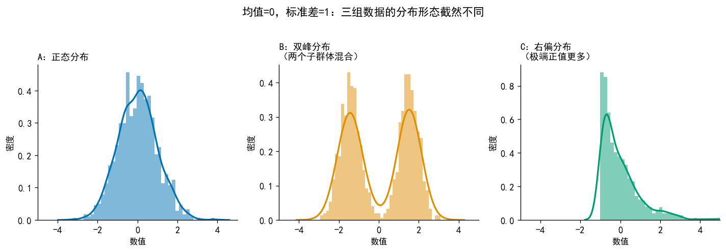
dist_names = ['正态分布', '右偏分布\n(正值离群值)', '左偏分布\n(负值离群值)', '厚尾分布\n(双侧离群值)']
x1 = np.random.normal(0, 1, N)
x2 = np.concatenate([np.random.normal(0, 0.8, int(N*0.9)),
                      np.random.uniform(2, 5, int(N*0.1))])    # 右偏
x3 = np.concatenate([np.random.normal(0, 0.8, int(N*0.9)),
                      np.random.uniform(-5, -2, int(N*0.1))])  # 左偏
x4 = stats.t.rvs(df=2, size=N)                                 # 厚尾

datasets = [x1, x2, x3, x4]

# 打印描述统计
print(f'{"分布":12s} {"均值":>8s} {"标准差":>8s} {"偏度":>8s} {"超额峰态":>8s}')
for name, d in zip(dist_names, datasets):
    label = name.split('\n')[0]
    print(f'{label:12s} {d.mean():8.3f} {d.std():8.3f} '
          f'{stats.skew(d):8.3f} {stats.kurtosis(d):8.3f}')

# ── 绘图:2行4列 ──────────────────────────────────────────
fig, axes = plt.subplots(2, 4, figsize=(14, 7))
colors = sns.color_palette('colorblind', 4)

for col, (name, data, color) in enumerate(zip(dist_names, datasets, colors)):
    # 上行:直方图 + KDE
    ax_top = axes[0, col]
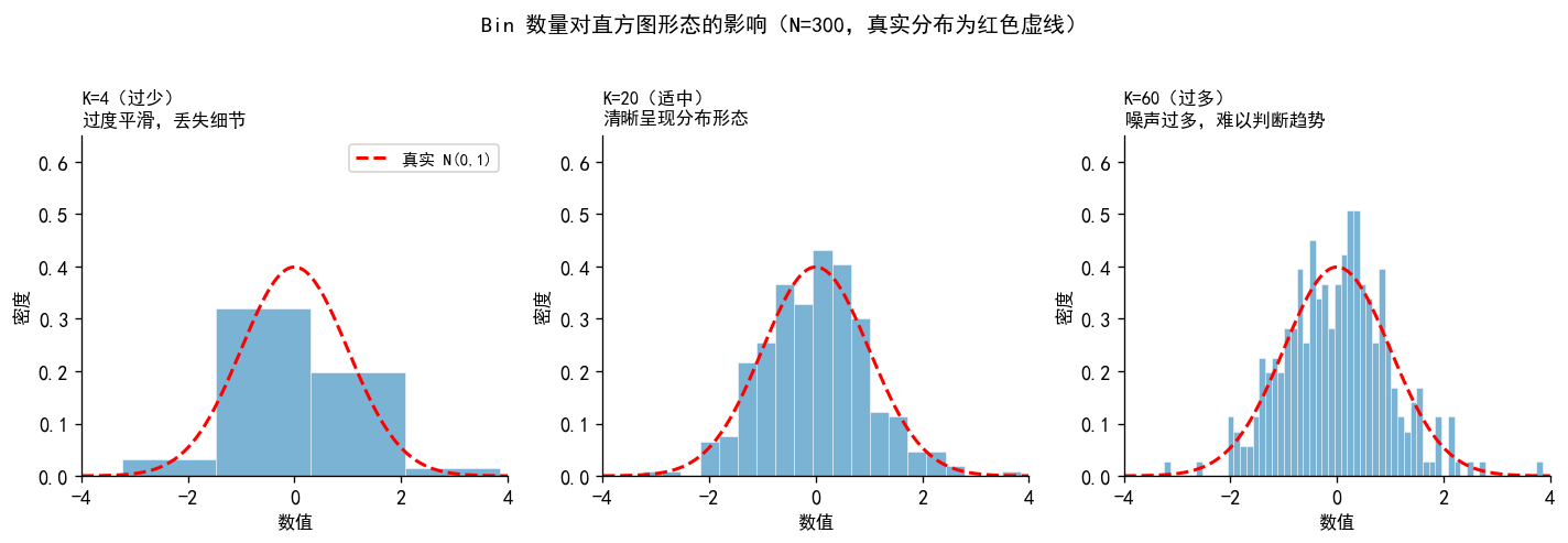
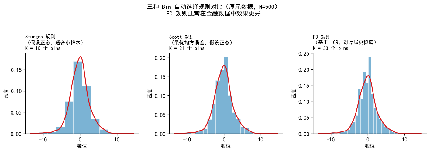
    ax_top.hist(data, bins='fd', density=True, color=color,
                alpha=0.5, edgecolor='white', linewidth=0.3)
    sns.kdeplot(data, ax=ax_top, color=color, linewidth=2)
    ax_top.set_title(name, fontsize=10, fontweight='bold', loc='left')
    ax_top.set_xlabel('')
    if col == 0:
        ax_top.set_ylabel('密度', fontsize=10)
    sns.despine(ax=ax_top)

    # 下行:小提琴图
    ax_bot = axes[1, col]
    ax_bot.violinplot(data, positions=[0], showmedians=True,
                     showextrema=False)
    ax_bot.set_xticks([])
    # 叠加箱线图核心统计量
    q1, q2, q3 = np.percentile(data, [25, 50, 75])
    ax_bot.scatter([0], [q2], color='white', s=30, zorder=3)
    if col == 0:
        ax_bot.set_ylabel('数值', fontsize=10)
    sns.despine(ax=ax_bot, bottom=True)

axes[0, 0].text(-0.2, 0.5, '直方图\n+ KDE', transform=axes[0,0].transAxes,
                rotation=90, va='center', fontsize=9, color='gray')
axes[1, 0].text(-0.2, 0.5, '小提琴图', transform=axes[1,0].transAxes,
                rotation=90, va='center', fontsize=9, color='gray')

plt.suptitle('四种典型分布形态的可视化诊断(N=300)',
             fontsize=13, fontweight='bold', y=1.01)
plt.tight_layout()
plt.show()
分布                 均值      标准差       偏度     超额峰态
正态分布           -0.006    0.983    0.174    0.567
右偏分布            0.340    1.350    1.516    2.340
左偏分布           -0.307    1.267   -1.238    1.982
厚尾分布            0.200    1.932    0.536    2.931

18.11 偏态与峰态的可视化

np.random.seed(42)
N = 2000
x_range = np.linspace(-6, 10, 500)

fig, axes = plt.subplots(1, 2, figsize=(12, 4))

# ── 左图:偏态对比 ────────────────────────────────────────
ax = axes[0]
palette = sns.color_palette('colorblind', 3)

for dist, label, color, ls in [
    (stats.norm(0, 1),         '对称  偏度=0.0',   palette[0], '-'),
    (stats.gamma(2, scale=1),  '右偏  偏度>0',     palette[1], '--'),
    (stats.gamma(2, scale=-1, loc=6), '左偏  偏度<0', palette[2], '-.')
]:
    ax.plot(x_range, dist.pdf(x_range), color=color,
            linewidth=2, linestyle=ls, label=label)

ax.set_title('偏态:分布的不对称程度', fontsize=12, fontweight='bold', loc='left')
ax.set_xlabel('数值', fontsize=10)
ax.set_ylabel('密度', fontsize=10)
ax.legend(fontsize=10)
ax.set_xlim(-4, 10)
sns.despine(ax=ax)

# ── 右图:峰态对比 ────────────────────────────────────────
ax = axes[1]
x2 = np.linspace(-6, 6, 500)

for dist, label, color, ls in [
    (stats.norm(0, 1),   '正态分布  超额峰态=0',     palette[0], '-'),
    (stats.t(df=3),      '厚尾(t, df=3)超额峰态>0', palette[1], '--'),
    (stats.uniform(-2,4),'薄尾(均匀)超额峰态<0',   palette[2], '-.')
]:
    ax.plot(x2, dist.pdf(x2), color=color,
            linewidth=2, linestyle=ls, label=label)

ax.set_title('峰态:尾部的厚薄程度', fontsize=12, fontweight='bold', loc='left')
ax.set_xlabel('数值', fontsize=10)
ax.set_ylabel('密度', fontsize=10)
ax.legend(fontsize=10)
ax.set_xlim(-5, 5)
ax.set_ylim(0, 0.55)
sns.despine(ax=ax)

plt.suptitle('分布形态的两个关键维度:偏态与峰态',
             fontsize=13, fontweight='bold')
plt.tight_layout()
plt.show()

18.12 QQ 图:四种分布对比

np.random.seed(42)
N = 500

samples = {
    '正态分布\n(应落在参考线上)':    np.random.normal(0, 1, N),
    '右偏分布\n(右尾向上偏离)':       stats.chi2.rvs(df=3, size=N),
    '左偏分布\n(左尾向下偏离)':      -stats.chi2.rvs(df=3, size=N),
    '厚尾分布\n(两端均偏离,S形)':    stats.t.rvs(df=3, size=N),
}

fig, axes = plt.subplots(1, 4, figsize=(14, 4))

for ax, (title, data) in zip(axes, samples.items()):
    # scipy.stats.probplot 返回 (理论分位数, 样本分位数)
    (theoretical, sample), fit = stats.probplot(data, dist='norm')
    ax.scatter(theoretical, sample, color='#4393c3',
               s=8, alpha=0.5, zorder=2)
    # 参考线
    slope, intercept = fit[0], fit[1]
    x_line = np.array([theoretical.min(), theoretical.max()])
    ax.plot(x_line, slope * x_line + intercept,
            'r--', linewidth=1.5, zorder=3)
    ax.set_title(title, fontsize=10, fontweight='bold', loc='left')
    ax.set_xlabel('正态理论分位数', fontsize=9)
    if ax == axes[0]:
        ax.set_ylabel('样本分位数', fontsize=9)
    sns.despine(ax=ax)

plt.suptitle('QQ 图:识别数据偏离正态分布的方向和程度',
             fontsize=13, fontweight='bold', y=1.02)
plt.tight_layout()
plt.show()

18.13 多组分布比较:宏观经济数据金融案例

使用 statsmodels 自带的美国宏观数据,比较不同年代 GDP 增速的分布。

import statsmodels.api as sm

# ── 加载数据 ──────────────────────────────────────────────
macro = sm.datasets.macrodata.load_pandas().data
macro['year'] = macro['year'].astype(int)

# 计算实际 GDP 季度对数增速(%)
macro['gdp_growth'] = np.log(macro['realgdp']).diff() * 100
macro = macro.dropna()

# 按年代分组
def decade_label(year):
    d = (year // 10) * 10
    return f'{d}s'

macro['decade'] = macro['year'].apply(decade_label)
decades_order = ['1960s', '1970s', '1980s', '1990s', '2000s', '2010s']
macro = macro[macro['decade'].isin(decades_order)]

print(f'数据:{macro.year.min()}{macro.year.max()} 年,共 {len(macro)} 个季度')
print('\n── 各年代 GDP 增速(%)描述统计 ──')
print(macro.groupby('decade')['gdp_growth'].agg(
    均值='mean', 标准差='std', 偏度=stats.skew, 最小值='min', 最大值='max'
).round(3))

# ── 图1:分组箱线图 ───────────────────────────────────────
fig, (ax1, ax2) = plt.subplots(2, 1, figsize=(10, 9))

palette = sns.color_palette('colorblind', len(decades_order))
sns.boxplot(data=macro, x='decade', y='gdp_growth',
            order=decades_order, palette=palette,
            width=0.55, ax=ax1,
            flierprops=dict(marker='o', markersize=4, alpha=0.5))
ax1.axhline(0, color='black', linewidth=0.8, linestyle='--', alpha=0.4)
ax1.set_xlabel('')
ax1.set_ylabel('季度实际 GDP 对数增速(%)', fontsize=11)
ax1.set_title('各年代美国 GDP 增速分布:箱线图\n(2000s 波动显著加大,出现大量负增长)',
              fontsize=12, fontweight='bold', loc='left')
sns.despine(ax=ax1)

# ── 图2:叠加 KDE ─────────────────────────────────────────
for decade, color in zip(decades_order, palette):
    subset = macro[macro['decade'] == decade]['gdp_growth']
    ls = '-' if decade in ['1960s', '1990s', '2010s'] else '--'
    sns.kdeplot(subset, ax=ax2, color=color, linewidth=1.8,
                linestyle=ls, label=decade)

ax2.axvline(0, color='black', linewidth=0.8, linestyle='--', alpha=0.4)
ax2.set_xlabel('季度实际 GDP 对数增速(%)', fontsize=11)
ax2.set_ylabel('密度', fontsize=11)
ax2.set_title('各年代 GDP 增速分布:叠加 KDE\n(2000s 双峰特征明显,反映金融危机的结构性断裂)',
              fontsize=12, fontweight='bold', loc='left')
ax2.legend(title='年代', fontsize=10, title_fontsize=10)
sns.despine(ax=ax2)

plt.suptitle('美国实际 GDP 增速分布的跨期演变(1960–2019)',
             fontsize=13, fontweight='bold', y=1.01)
plt.tight_layout()
plt.show()
数据:1960–2009 年,共 199 个季度

── 各年代 GDP 增速(%)描述统计 ──
           均值    标准差     偏度    最小值    最大值
decade                                   
1960s   1.064  0.876 -0.375 -1.291  2.426
1970s   0.808  1.097  0.378 -1.224  3.859
1980s   0.748  0.974 -1.005 -2.071  2.223
1990s   0.817  0.547 -0.830 -0.880  1.780
2000s   0.423  0.683 -0.902 -1.661  1.932

18.14 金融收益率的风格化特征诊断

用宏观消费数据模拟金融数据的分布特征诊断流程。

import statsmodels.api as sm

# ── 数据准备 ──────────────────────────────────────────────
macro = sm.datasets.macrodata.load_pandas().data
macro['cons_growth'] = np.log(macro['realcons']).diff() * 100
data = macro['cons_growth'].dropna().values

# ── 描述统计 ─────────────────────────────────────────────
mean_val  = data.mean()
std_val   = data.std()
skew_val  = stats.skew(data)
kurt_val  = stats.kurtosis(data)  # 超额峰态
jb_stat, jb_pval = stats.jarque_bera(data)
n_outliers = np.sum((data < np.percentile(data, 25) - 1.5 * stats.iqr(data)) |
                    (data > np.percentile(data, 75) + 1.5 * stats.iqr(data)))

print('── 美国实际消费季度对数增速(%)描述统计 ──')
print(f'  均值:      {mean_val:.4f}%')
print(f'  标准差:    {std_val:.4f}%')
print(f'  偏度:      {skew_val:.4f}  (负偏:极端负值更多)')
print(f'  超额峰态:  {kurt_val:.4f}  (>0:厚尾)')
print(f'  Jarque-Bera 检验: 统计量={jb_stat:.2f}, p值={jb_pval:.4f}')
print(f'  箱线图离群值: {n_outliers} 个({n_outliers/len(data)*100:.1f}%,正态预期约 0.7%)')

# ── 三合一诊断图 ─────────────────────────────────────────
fig, axes = plt.subplots(1, 3, figsize=(14, 4))

# 左:密度直方图 + KDE + 正态曲线
ax = axes[0]
ax.hist(data, bins='fd', density=True, color='#b2d8f0',
        edgecolor='white', linewidth=0.3, alpha=0.7, label='密度直方图')
sns.kdeplot(data, ax=ax, color='#2166ac', linewidth=2, label='KDE')
x_fit = np.linspace(data.min(), data.max(), 300)
ax.plot(x_fit, stats.norm.pdf(x_fit, mean_val, std_val),
        'r--', linewidth=1.8, label='正态拟合')
ax.set_title(f'密度直方图 + KDE\n偏度={skew_val:.2f}, 超额峰态={kurt_val:.2f}',
             fontsize=10, fontweight='bold', loc='left')
ax.set_xlabel('季度增速(%)', fontsize=10)
ax.set_ylabel('密度', fontsize=10)
ax.legend(fontsize=9)
sns.despine(ax=ax)

# 中:箱线图
ax = axes[1]
bp = ax.boxplot(data, vert=True, patch_artist=True, widths=0.5,
                boxprops=dict(facecolor='#b2d8f0', linewidth=1.5),
                medianprops=dict(color='#d7191c', linewidth=2.5),
                flierprops=dict(marker='o', markersize=5,
                                markerfacecolor='#d7191c', alpha=0.6))
ax.set_xticks([])
ax.set_ylabel('季度增速(%)', fontsize=10)
ax.set_title(f'箱线图\n离群值 {n_outliers} 个({n_outliers/len(data)*100:.1f}%)\n正态预期约 0.7%',
             fontsize=10, fontweight='bold', loc='left')
sns.despine(ax=ax, bottom=True)

# 右:QQ 图
ax = axes[2]
(theoretical, sample), fit = stats.probplot(data, dist='norm')
ax.scatter(theoretical, sample, color='#4393c3', s=15, alpha=0.6)
x_line = np.array([theoretical.min(), theoretical.max()])
ax.plot(x_line, fit[0] * x_line + fit[1], 'r--', linewidth=1.8)
ax.set_title('QQ 图\n两端偏离参考线 → 厚尾',
             fontsize=10, fontweight='bold', loc='left')
ax.set_xlabel('正态理论分位数', fontsize=10)
ax.set_ylabel('样本分位数', fontsize=10)
sns.despine(ax=ax)

plt.suptitle('美国实际消费增速的分布诊断:非正态性的多角度验证',
             fontsize=13, fontweight='bold', y=1.02)
plt.tight_layout()
plt.show()

print(f'\n结论:Jarque-Bera 检验 p 值={jb_pval:.4f},'
      + ('强烈拒绝正态假设' if jb_pval < 0.05 else '不拒绝正态假设'))
── 美国实际消费季度对数增速(%)描述统计 ──
  均值:      0.8368%
  标准差:    0.6926%
  偏度:      -0.6019  (负偏:极端负值更多)
  超额峰态:  2.0431  (>0:厚尾)
  Jarque-Bera 检验: 统计量=47.33, p值=0.0000
  箱线图离群值: 5 个(2.5%,正态预期约 0.7%)


结论:Jarque-Bera 检验 p 值=0.0000,强烈拒绝正态假设